Designing with hierarchy and clarity means structuring your page so that users can easily scan, understand, and act on your content. Visual hierarchy helps guide attention—using headings, spacing, color, and layout to signal what’s most important. Start with clear goals for each page, then organize content to support those goals in a logical flow.
Sections are a key part of this structure. Use distinct content blocks grouped into purposeful sections to break up your page into meaningful parts. A section might introduce a concept, offer supporting details, or present a call to action. Thoughtfully combining headings with white space and consistent formatting helps users follow the narrative without confusion or fatigue.
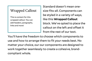
Avoid cramming too much into one area. Instead, build your page by stacking content blocks into well-defined sections that visually and conceptually support your message. This not only improves readability, but also makes the page more accessible and easier to update over time.