The Action Banner is designed to capture your audience’s attention. Use this Block to promote key messaging and calls to action.
- Combines a background image, heading, and call to action
- Option to include limited supporting text
- Design options for overlay position and color
- Can be used in the Banner or Content Region of your page
- Should not be used concurrently
- Intended for minimal copy and prominent calls to action
- Using multiple Action Banners on a page may overwhelm or confuse users
Action Banner Design Options
- Optional Banner Content: You can choose to add a short message to your Action banner or leave it blank
- Theme: Choose a color for the content overlay based on the color palette of your site
- Layout: Display your message and Call to action on the bottom, left or right side of your block
- Heading Level: Set the title of your Action Banner as the H1 for your page, or keep it as an H2 heading
- Optional Second Link: Add a second link In addition to the required Call-to-action
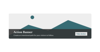
Action Banner Example
Below is an example of the Action Banner being used on this page.

Tips and Tricks
- Placement Matters: Use the Action Banner block near the top of the page or between sections where users are likely to take action.
- Don’t Overuse It: Action Banners are impactful but lose their effectiveness if overused. Reserve them for your most critical calls to actions or announcements.
- Choose High-Quality Images: Select relevant, high-quality media using images that provide additional context. Avoid using graphics, logos, branding, or images of text
- Consider the Grand Hero Block: Unlike the Action Banner block, the Grand Hero includes the option to use a video backdrop, in addition to different styling options. If you intend to create a call to action in the Banner region of your page, you may want to consider the Grand Hero block.
Building With Blocks
This resource will help you understand the Blocks available and how to use them to make your content shine.