Layout Builder is the visual editing environment where you’ll assemble the Blocks best suited to your content needs.

The Layout Builder allows you to easily assemble content blocks, customize settings, and adjust layouts.
-
Preview your content as you build
-
Quickly add, remove, and drag and drop Blocks to build out your content
-
Streamline your workflow with built-in revision history and version control.
This editing environment is available for all YaleSite content types. Selecting the appropriate content type is key in building and managing an effective and engaging website.
How to use layout builder
Select Edit Layout and Content in the top toolbar to enter building mode.


4
Enter layout build mode
Select Edit Layout and Content in the top toolbar to enter building mode.
Adding blocks in layout building
Select the appropriate area to add a content block. The top area is for top of site blocks such as a banner. The main content region can be build out with sections and different layouts and content blocks.
Add a content block
Choose a content block that perfectly suited to your website’s requirements and design preferences.
Editing a content block
Once a block is added to the layout build it can be edited by rollover to reveal a pencil icon at the top left. This will provide a menu of options.
Once in the layout builder you have a few options for adding blocks and sections. The number and placement of buttons will depend on the content type, while the region determines which Blocks are available.
- Banner Region: an optional, visually engaging banner area used on the Page content type. Limited Block selection.
- Content Region: the main content-building area for all content types. All Blocks are available.
- Sections: the ability to organize and create different sections of content in the content region with different layout options such as two columns.
When in Layout Builder, the Blocks you add are outlined with dashes to help you visualize where they begin and end.
Building With Blocks
This resource will help you understand the Blocks available and how to use them to make your content shine.

Options available to you when configuring a YaleSites Block in Layout Builder
Editing a content block
Once a block is added to the layout, hover over it to reveal a pencil icon at its top left. Selecting the pencil opens a menu of actions for that block:
- Configure — open the block’s content fields and design options
- Move — reposition the block within the layout
- Clone — create a copy of the block, placed directly below the original
- Remove — delete the block from the page
Reusable blocks show one additional action, Make non-reusable, described below. Like every other Layout Builder change, these actions take effect when you save the layout.
Cloning a block
Clone copies a block along with everything in it — its design options, its text and images, and any items inside it such as accordion items, cards, tabs, or gallery images. The copy is inserted directly after the original, ready for you to edit.
This is the fastest way to build a series of blocks that share the same look. Add and style one block the way you want it, clone it, and change only the content in the copy.
The copy is fully independent. Editing the clone does not change the original, and editing the original does not change the clone.
Clone does not appear on reusable blocks. A reusable block is already shared across pages, so to use it again you place it again rather than copying it. If you want an independent copy of a reusable block on one page, use Make non-reusable first, then clone.
Making a block non-reusable
When a block has been marked reusable, its menu includes Make non-reusable. This detaches the placement you are working on and turns it into a standalone block that belongs to this page only.
It affects this placement only. Every other page where that reusable block appears is untouched and keeps working exactly as before. The original block stays in Manage Reusable Blocks, still reusable.
This can’t be undone. A confirmation dialog appears before the change is made, explaining what will and will not be affected. Once you detach a placement, there is no way to reconnect it to the original reusable block — if you change your mind, remove the detached block and place the reusable block again.
Drop and Dragging
While using the Layout Builder, you can rearrange blocks on your YaleSite by clicking and dragging them. To view your page’s content in a more condensed manner, go to the second admin toolbar and, under Display Options, toggle Preview Content. This will enable you to see only the administrative labels of your blocks and drag and drop them in a more condensed view with less scrolling on your page.
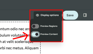
Toggle between content and administrative labels via Preview Content
Condensed View
Use administrator labels and the display options to streamline your content management in the Layout Builder. By assigning labels to your content blocks, you can create a condensed view, making it easier to organize and manage longer pages efficiently.
Editorial Workflow: Drafts and Publishing
The editorial workflow allows for your team to regulate content creation, management, and publishing, guaranteeing a seamless and productive process.