Tabs are an interactive block used to organize related groups of text-based content into distinct categories. Unlike Accordions, only one tab can be viewed at a time.
- The first Tab is displayed by default
- Use short, specific headings, ideally four words or fewer
- Tabs should be related, but each Tab should be a self-contained chunk of information
- Users may not view the contents of each Tab
- Limit the amount of content presented in Tabs and the number of Tabs used
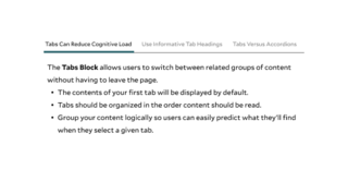
The Tabs Block allows users to switch between related groups of content without having to leave the page.
- The contents of your first tab will be displayed by default.
- Tabs should be organized in the order content should be read
- Group your content logically so users can easily predict what they’ll find when they select a given tab
Lorem ipsum dolor sit amet, consectetur adipiscing elit, sed do eiusmod tempor incididunt ut labore et dolore magna aliqua. Ut enim ad minim veniam, quis nostrud exercitation ullamco laboris nisi ut aliquip ex ea commodo consequat. Duis aute irure dolor in reprehenderit in voluptate velit esse cillum dolore eu fugiat nulla pariatur. Excepteur sint occaecat cupidatat non proident, sunt in culpa qui officia deserunt mollit anim id est laborum.
Both Tabs and Accordions help organize and consolidate content but have different use cases.
- Use the Accordion Block when users need to view more than one item at a time
- Use the Tab Block for related, self-contained categories of content that are neither sequential nor interdependent
- When in doubt, use the Text Block and organize your content with clear, descriptive headings
Tabs Options
Adjust the weight of each tab to determine the hierarchy. You can show or hide the row weights using the option in the top right corner of the editing section. By default, the tabs will appear in order that they were created.
Building With Blocks
This resource will help you understand the Blocks available and how to use them to make your content shine.