Building Your Menu

The YaleSites platform features a new process for building and maintaining menus. We’ve moved away from hover-based interactions and streamlined the navigational approach to offer visitors a consistent and accessible experience across all sites, devices, and platforms.

This resource will help you understand how the YaleSites menus work and how to combine them with wayfinding tactics to ensure users can easily navigate your YaleSite.

How to prepare

While Building Your Menu can be a helpful standlone resource, we encourage you to review the following materials to ensure you’re comfortable with these important foundational topics.

Jump to a section

YaleSites menus overview

Your YaleSite includes two menus: the Main Menu, which is your primary navigation, and the optional Utility Menu, which is used for secondary task-based menu items that are distinct from your main menu.

Your site’s navigation is responsive and adjusts based on the size of a visitor’s screen. Level one links stack, followed by Utility Menu links and the site search.

Navigation Types

The Navigation Type determines the style and behavior of your Main Menu. It can be adjusted via Settings: Header Settings.


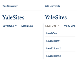
examples of the basic menu at the top level and with the dropdown exposed

Left: Level one links in the Basic Nav. Right: Level two links as they appear in dropdown menus.

Basic Nav

By default, your YaleSite uses the Basic Nav, which supports up to two levels of depth. Most websites on the YaleSites platform will benefit from using the Basic Nav.

  • Level One menu items are arranged horizontally and always visible on large screens.
  • Does not require the use of dropdown menus. When Level Two menu items are included, an icon indicates a dropdown menu is present.
  • Level Two menu items stack vertically in a dropdown following the Level One link. The icon’s direction changes, indicating the dropdown can be collapsed.
mega menu dropdowns display level two and three links in responsive columns

The Mega Nav’s dropdown menus display up to three levels of depth within responsive columns.​

Mega Nav

The Mega Nav supports up to three levels of depth and should not be used unless level three menu links are present throughout your main menu. Complex, page-dense sites may benefit from using the Mega Nav.

At the top level, the Mega Nav is identical to the Basic Nav, while the dropdown menus utilize distinct styling and functionality.

  • Level One links display as a heading at the top of the dropdown menu alongside a customizable call to action
  • Dropdown menu links are displayed in responsive columns that adjust based on the browser’s width
  • YaleSites will attempt to display menu items evenly within the dropdown. Adjusting a level 2 menu link’s hierarchy will change the visual display of the dropdown menu
example of a full screen homepage

The Focus Nav combines a customizable full-screen homepage image with minimal navigational elements.

Focus Nav

The Focus Nav supports one level of depth and is paired with a full-screen homepage image. Simple sites with limited pages and access to high-quality imagery may benefit from using the Focus Nav.

  • Level One menu items are arranged horizontally and always visible on large screens
  • Site Search and Utility menu items are not displayed on desktop or mobile
  • Navigation position cannot be adjusted
  • Requires adding a full-screen homepage image

Our new approach to site menus and navigation is backed by a dedicated web accessibility team and informed by comprehensive testing.  

You may be required to re-evaluate your site structure when rebuilding websites reliant upon secondary in-page menus. By combining a flat website architecture, Blocks, and embracing information architecture best practices, you can create clear pathways to guide users to your content.

  • Click-Based Dropdown Menus: Hover-triggered menus present many usability and accessibility challenges, while click-based menus respect user intent and offer a unified and accessible experience for site visitors.
  • Level One Menu Item Placement: Presenting level one menu items within dropdowns creates clear pathways to top-level pages while providing a consistent user experience across devices.
  • Streamlined Navigation: Your Main Menu should provide access to the site resources and information your users need to accomplish their goals. Secondary menus often contribute to overly deep site structures that introduce duplicative menu items and confusing navigational pathways.
  • Breadcrumb Navigation: Breadcrumbs show users where they are in the site hierarchy while offering a quick path to higher-level parent pages.YaleSites will automatically add breadcrumbs to content at a depth of level two or greater.

Characteristics of an Ideal Menu

A well-structured menu is critical for providing a good user experience on your website.

  • Menus are organized to support user journeys
    •  Your menus should guide users along a clear and easy path. Prioritize menu items based on your goals, objectives, and the needs of users.
  • Labels are succinct, clear, unique, and meaningful
    • Labels should be easily understood by users and align with content. Avoid acronyms, jargon, or oversimplified categories.
  • Links behave in a consistent, trustworthy manner
    • When menu links point to external websites or a downloadable resource, it causes frustration, erodes trust, and can lead to confusion.
  • Menus are simple, focused, and support discoverability
    • Limit the number of choices, but be careful not to oversimplify to the point of abstraction.

Understanding who your primary audience is and what they need to learn or accomplish while on your website empowers the creation of user-centric menus. Consider using card sorting exercises and tree testing during your planning phase. If you’re unfamiliar with these activities, review NN/g’s Tree Testing vs. Card Sorting: Different Purposes.

Building your menu

Whether starting fresh or rebuilding a site, the more effort you put into planning, the easier it will be to create effective menus.

  1. Plan your site structure
  2. Identify Utility Links
  3. Create Menu Items
  4. Select a Navigation Type
  5. Review and refine

Plan your site structure

If you haven’t completed our Basic Principles of Information Architecture and Content Audit trainings, we encourage you to do so. You’ll learn how to prepare a user-first sitemap, organize your content, and organizational techniques like the card sorting exercise.

  • Define primary goals and objectives
  • Identify your audiences and understand their priorities
  • Ensure content is audited and organized
  • Draft your site structure or prepare a sitemap

If you aren’t comfortable working with visualization tools, use a bulleted or numbered list to outline your site structure. This low-fidelity approach is a quick and effective way to ideate menu depth and structure.

The items in your Main Menu should lead to the content or sections of your website that directly align with your primary goals and objectives.

Review your site structure and identify items that better align with the Utility Menu. For example, supporting content like News, Events, Contact, Visit, or Job Listings may be better suited to the Utility Menu.

  • Secondary resources that fall outside of the primary focus of your website
  • Support links that users may need to access frequently

Create Menu Links

There are two ways to add and manage menu links on your YaleSite.

Page Level

Creating menus from the Page Level is the quickest and easiest option since you can add pages to menus as they are published. Build your level one page first. Once published, it can be set as the parent to a level two page.

  • Menu link title: Determines how a page’s link appears in menus. Uses the Page Title by default
  • Parent link: Use <Main navigation> for top-level pages, <Utility navigation> for utility links, or select a published page for level two and three links
  • Weight: Used to adjust the page’s position in the menu. The higher the number, the later the item appears in the menu

Go to Manage Settings for a page and expand the sidebar. Toggle “Provide a menu link.”

System Level

The System Level will save you time and effort when you need to adjust, rearrange, or view your menu structure in its entirety.

  • Add Link: Similar to adding at the Page Level. Use the Link search field to identify published content to add to menus.
  • Edit Button: Access the Page Level Menu Item options, set your Mega Nav call to action text, or delete a Menu Item.
  • Drag and drop: Grab a menu link’s handle to drag it to a new position. Drag left or right to increase or decrease the link’s depth.
  • Order by weight: Use “Show row weights” to organize menu links numerically.
  • Enabled: Pages within the menu are enabled by default. Uncheck to suppress a page from a menu while retaining parent/child associations and breadcrumb functionality.

Visit “Manage Main Menu” or “Manage Utility Menu” under “Content” in the admin menu.
 

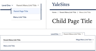
example of menu links in action

Menu Link Titles as they appear in the Basic Nav, breadcrumbs, and the Mega Nav.

Using Menu Link Titles

Use the Menu Link Title to optimize your menus. Menu Link Titles guide users to the content, while Page Titles provide search engines and visitors with context about the page.

  • Level one links: The Menu Link Title is used at the top level for all navigation types, as the heading in Mega Nav dropdowns, and in breadcrumbs. The level one Page Title is used inside the Basic Nav dropdowns
  • Level two and deeper: The Menu Link Title is used in Basic and Mega Nav dropdowns and breadcrumbs

The Menu Link Title offers additional flexibility and control for optimizing your website’s navigation. While there’s nothing wrong with using the same terms, at times, it will be appropriate or advantageous to differentiate your Menu Link and Page Titles.

  • Evaluate on a page-by-page basis and adjust as necessary.
  • Keep navigation labels short and user-friendly
  • Focus on guiding users to content
  • Consider search engine optimization
  • Do not simplify to the point of abstraction

Deactivating Menu Links

Uncheck the Enabled box to suppress menu items without impacting their URL structure or published status. This feature can help you keep menus clear and focused.

  • Child links inherit the parent link’s Enabled status
  • Pages are still published and discoverable via search engines
  • Breadcrumbs are displayed on child pages
  • URL structure and parent/child associations are maintained

Use this feature to remove dropdown menus. Build your menu as you would to display two or three levels of depth. Then, uncheck the Enabled box for the level two menu links. Though you’ve excluded these pages from your menu, you’ll maintain a proper SEO-friendly site hierarchy, and child pages will include breadcrumbs.

Select a Navigation Type

Once you’ve either built out or finalized your site structure, you’re ready to determine which Navigation Type is appropriate for your YaleSite.

  • Most sites will benefit from using the default Basic Nav
  • The Mega Nav should only be used when each dropdown menu within your Main Menu contains level three links
  • Minimalist sites may wish to use the Focus Nav

Go to Settings: Header Settings to manage your Navigation Type.

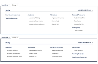
the order of your menu items will impact mega menus

Each dropdown contains the same links, illustrating the impact the order of level 2 menu items has on the Mega Nav’s appearance.

Organizing Mega Nav menus

On large screens, the Mega Nav attempts to display menu items evenly within dropdowns. Alignment is based on the number of items in each menu and the largest group of level 3 items.

If the automatic distribution of menu items interrupts scanning or results in gaps, you can change the order of level 2 menu items to rebalance the menu. Some fine-tuning may be required when dropdown menus contain a mix of depths, as shown in our example. While visually balanced menus are ideal, it is important to maintain logical groupings within your dropdown and to consider the impact reordering links might have on user experience.

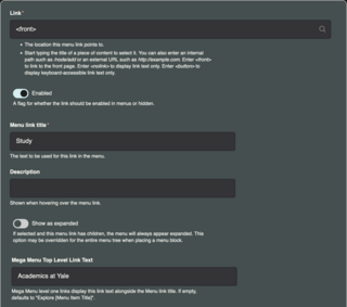
system level menu settings for a page

Set your custom link text by editing your level one page at the system level.

Mega Nav Call to Action

Mega Nav level one links display as a heading at the top of the dropdown menu alongside a call to action. To customize this link text, go to “Content: Manage Main Menu” and select “Edit” for your level one page.​

  • Link: The page your menu link points to​
  • Menu link title: Used at the top level for all menus and serves as the heading in Mega Nav dropdowns
  • Mega Menu Top Level Link Text: Custom call to action link text that accompanies the level one title in Mega Nav dropdown menus. Uses “Explore [Menu Link Title]” by default​

Much as is the case for Menu Link Titles, your Mega Nav’s top level link text should provide context for users. If your top-level page serves as an overview of the content within this section of your website, the default “Explore” text might be the best choice. Otherwise, use this field to help your users understand what they can expect to find when visiting the page.

Review and refine

The number of items in your Main Menu will depend on the breadth of your content, your goals, and your users’ needs. There’s no magic number for menu links, so focus on following best practices and ensure every page in your navigation serves a clear and specific purpose.

  • Menus are prioritized by goals and objectives
    • What are you trying to achieve?
    • What are users looking for?
  • Labels are succinct, clear, unique, and meaningful
  • Menus are user-centric, not audience-based
  • Items do not link to downloadable resources or external sites

When reviewing, consider how your menus will appear to a new site visitor. They should be able to easily understand where to find your high-priority content in order to accomplish tasks that support your goals and objectives.

Wayfinding beyond menus

Your menu is vital to your site’s user experience, but it isn’t the only way visitors will travel through your YaleSite. You can use Blocks to simplify content management and support user journeys.


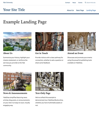
landing page created with the view Block

The pages in this section are tagged and use Teasers, allowing us to use the View Block to create a landing page.

Leverage Taxonomy

Taxonomy is a system for classifying and organizing content. Tags, which are part of your taxonomy, are custom terms used to describe your content. Once content is tagged, you can use the View Block to curate sections of your website.

  • Create custom landing pages
  • Highlight complementary resources
  • Connect users with audience-specific or topically related content
  • Spotlight faculty, staff, or other profiles
  • Build featured content areas

Before adding tags to your content, take a moment to develop your tagging strategy. Views can be built around included and excluded terms. Identifying how and where you’ll use the View Block helps you determine what content needs to be tagged and which tags are appropriate. Be certain to apply tags consistently and to review them regularly. Though tags autocomplete, it’s not uncommon for misspelled versions and other outliers to find their way into your taxonomy.

  • Determine how and where tags will be used
  • Identify which content should be tagged
  • Draft and review tags, ensuring they’re relevant, concise, and usable
  • Ensure tags are applied consistently
  • Set a cadence for reviewing and updating tags

Include a Call to Action

Research shows that people are more likely to complete an action when prompted. This prompt is referred to as a call to action (CTA).

CTAs take many forms, from a simple link to a full-width banner. By including prominent CTAs, you increase the likelihood of your audience understanding what steps you’d like them to take next.

Build for Breadcrumbs

Menu depth and site depth aren’t required to match. A clear, hierarchical site structure makes it easier for search engines to understand and index your website. If pages should be related, build those connections. You can suppress menu links to avoid dropdowns or to keep menus focused.

  • Go to Content: Manage Main Menu
  • Uncheck the Enabled box to suppress menu items