Working with images in YaleSites

Monday, November 6, 2023

The new YaleSites includes a medley of visually engaging Blocks, perfect for captivating your audience’s attention or simply providing a window into the beauty of Yale’s campus. But what size should your photo be? And why do some images appear blurry or pixelated after uploading?

This week, we’re covering which image dimensions work best in the Blocks and sharing tips for when you only have access to a low-resolution image.

Aspect ratios

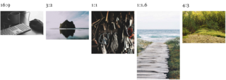
Aspect ratios describe the proportional relationship between the width and height of an image or screen. The first number represents the width, and the second the height.

aspect ratios preview

YaleSites uses an assortment of aspect ratios.

The easiest way to ensure your photos look their best is to resize them before uploading. First, determine which Blocks you’d like to use, then check the dimensions of your media assets. If your image size falls below the recommended minimum size, you’ll likely need to upscale to avoid blurring or pixelation.

Some Blocks, like the Content Spotlight, Image Block, and Wrapped Image, support multiple aspect ratios. You’ll need to consider how you plan on using them to determine the best aspect ratio to use.

For example, the Content Spotlight supports up to 500 characters of text. If you prefer your images and text to be balanced, a 3:2 aspect ratio is your best bet. When using a Wrapped Image, on the other hand, you’re able to include as much text as necessary. For this use case, a 1:1.6 aspect ratio would be an excellent choice.

Recommended Sizes

Block Aspect Ratio Minimum Dimensions
Image multiple 900 pixels wide
Wrapped Image multiple 640 pixels wide
Content Spotlight multiple 800 pixels wide
Action Banner, 
Grand Hero
16:9 1280x720 pixels
Media Grid, 
Gallery
3:2 480x320 pixels
Custom Cards, 
Teasers
3:2 480x320 pixels
Profile Card 1:1 400x400 pixels
Reference Card 4:3 640x480 pixels

Working with low-resolution images

You may have encountered a scenario where you’ve uploaded an image only to find it stretched or pixelated after it’s added to your page. When this occurs, it’s a sign that your image’s resolution is too small. If this happens, there are a couple of approaches you can consider.

  • Determine whether an image is necessary or simply decorative. For example, if you’re using an image in the place of an icon, it’s best to skip the image altogether.
  • Select a suitable replacement image. If you can’t create a higher-resolution version of your original image from the source materials at hand, consider whether another image might do the trick. Luckily, the Office of Public Affairs & Communications maintains an archive of curated images of the Yale campus, its programs, and its people.
  • Upscale your image. Sometimes referred to as upsampling, upscaling is the process of maintaining or even improving the quality and details of media when it needs to be displayed at a larger size.

You can use photo editing software like Adobe Photoshop to enhance your images, but these days, you also have the option of using AI to breathe fresh life into your media files. AI image enhancement tools are often easier to use than photo editing software and also yield excellent results.

Yale offers a free subscription to Adobe’s Creative Cloud. Visit Software at Yale to get started. If you opt to explore AI options for image enhancement, please adhere to the University’s guidelines, which uphold our institutional commitment to safety, security, and academic integrity.

Resources

You may have noticed we didn’t cover cropping or other aspects of media management. The YaleSites Team is in the process of enhancing this offering, so stay tuned for updates. 

If you’re curious what else is in store for YaleSites, we encourage you to visit the Product Roadmap.

Browse More Tips & Tricks

Finished exploring these tips and tricks? There’s plenty more enriching content to discover on our main page. 

Back to Tips & Tricks