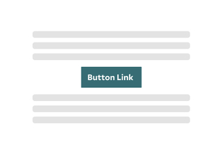
The Button Link Block helps to emphasize the importance of a call to action on your page.

Adding buttons to your site content is essential for guiding users. They should be able to scan your page and easily identify where to take action. Use buttons for important links, but consider whether a text link might be more appropriate in certain situations.
Buttons should be positioned near related content and clearly labeled, ensuring that users understand the action they’ll take when clicked. This thoughtful placement enhances usability and encourages interaction with your site.
Button Block Options
When creating your site content, the button block offers the flexibility to include either a single button or two buttons side by side, although only one button is required. In the two-button layout, the first button is styled as the primary button, featuring a distinct color that sets it apart from the secondary button.
Button Examples
Below are examples of the button block being used on this page.
Tips and Tricks
- Enhance Engagement: Position a button block after a text block to create a compelling content section that combines information with a clear call to action.
- Prioritize Actions with Two Buttons: When using two buttons, make the first one the primary action to guide users toward your most important goal. This clear hierarchy helps direct attention and encourages user engagement effectively.
- Limit the Number of Buttons: Use a limited number of buttons to avoid overwhelming users. Focus on key actions to streamline navigation and improve clarity.
- Create Visual Separation: Using a divider block after a button block to effectively separate different topics, giving your layout a clean and organized look.
Building With Blocks
This resource will help you understand the Blocks available and how to use them to make your content shine.