Reference Card

reference card icon

The Reference Card allows you to take an existing piece of content–a Post, Event, or Profile–and show it off on an eye-catching card

  • A Reference Source to display is required
  • Style the card as featured to overlay the card on top of the content, or Non-featured to serve as a backdrop

This block is perfect for promoting content with no additional editing required. Potential uses include the following:

  • Prevent an announcement from being buried under more recent pieces of news
  • Highlight a member of your department
  • Remind your audience of an upcoming event

Reference Card Design Options

For any of the three available content types, the reference card block will feature the title, teaser media and teaser text from the reference source. The card will contain the title and text, while the image remains separate. This block offers two styling options. 

Featured: The card will overlay the teaser image

Non-featured: The card will serve as a backdrop with the teaser image on top

Reference Card Examples

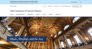
Below are examples of the reference card being used on this page.

The first block displays a reference card that uses the featured styling option, while the second exhibits the non-featured option. 

  • Make the most of your YaleSite

    Whether starting from scratch or rebuilding an existing site, our guide will help you make the most of your YaleSite.

Tips and Tricks

  • Make sure that that the content chosen for your reference card contains a teaser image and text to avoid empty space.
  • Reintroduce information that needs to remain easily accessible.
  • Add more visibility to an event or post by displaying a reference card in other sections of your website

Building With Blocks

This resource will help you understand the Blocks available and how to use them to make your content shine.

View This Resource