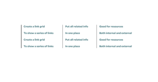
Use the Link Grid block to display columns of important links, such as resources and related content, in a clean and organized layout.

The Link Grid presents a simpler design than blocks such as Quick Links or Tile Cards. This feature is perfect for directing users to valuable information and enhancing their navigation experience.
Link Grid Design Options
The link grid block can have up to 4 “Link Lists” with as many “Link Items” inside it as you would like. The link lists are displayed as columns next to each other.
Optional Title: You can choose to give your link grid a title or leave it blank.
Color: In the theme option you can select different color for the vertical bar to the left of the link lists based on your site theme.
Link Grid Examples
Below are examples of the link grid block being used on this page. Notice the different number of link list and items and color of the vertical bars.
A Link Grid with One Link List
A Link Grid with Two Link Lists
Tips and Tricks
- Keep It Organized: Group related links together to make navigation intuitive. Use headings or categories to clearly define each section.
- Use Descriptive Labels: Ensure each link is clearly labeled with concise, descriptive text, so users know exactly where they will be directed.
- Prioritize Important Links: Place the most important or frequently used links at the top of the grid for easy access.
- Limit the Number of Links: Avoid overwhelming users by limiting the number of links in a grid. Focus on the most relevant and useful options.
Building With Blocks
This resource will help you understand the Blocks available and how to use them to make your content shine.