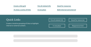
The Quick Links Block is designed to highlight a group of related calls to action in an eye-catching way. Consider what actions users need to take next when deciding where to place the Quick Links Block.

- Use when you have three or more related links
- Supports including optional summary text
- Button placement adjusts to a user’s screen size
- Includes an option to add a subtle background image to the Quick Links banner
- Creates a visual break within your content when used between Blocks or hugs the footer when used last on a page
Quick Links Design Options
When building your site, Quick Links offer flexibility and options to create an easy navigation path for your users within your content.
Amount of Links: The design of the quick link block needs minimal of three links but can have up to 8.
Background Image: A media option allows for you to select an image that shows as a background for the block with a default color overlay based on your site theme.
Quick Links Examples
Below are examples of the quick links block being used on this page.
Example with Background Image
This is content area with a 100 character limit.

Example of Three Quick Links
This example shows the required minimal number of links (three) for a quick link block.
Example of Nine Quick Links
This example shows the max number of links (nice) for a quick link block.
Tips and Tricks
- Organize User-Related Links: Group only user-related links in a single Quick Links block to help users find relevant resources quickly.
- Use Clear Labels: Ensure each link has a descriptive label that clearly indicates its purpose or destination.
- Prioritize Key Links: Place the most important links at the top of the list for easy access.
Building With Blocks
This resource will help you understand the Blocks available and how to use them to make your content shine.